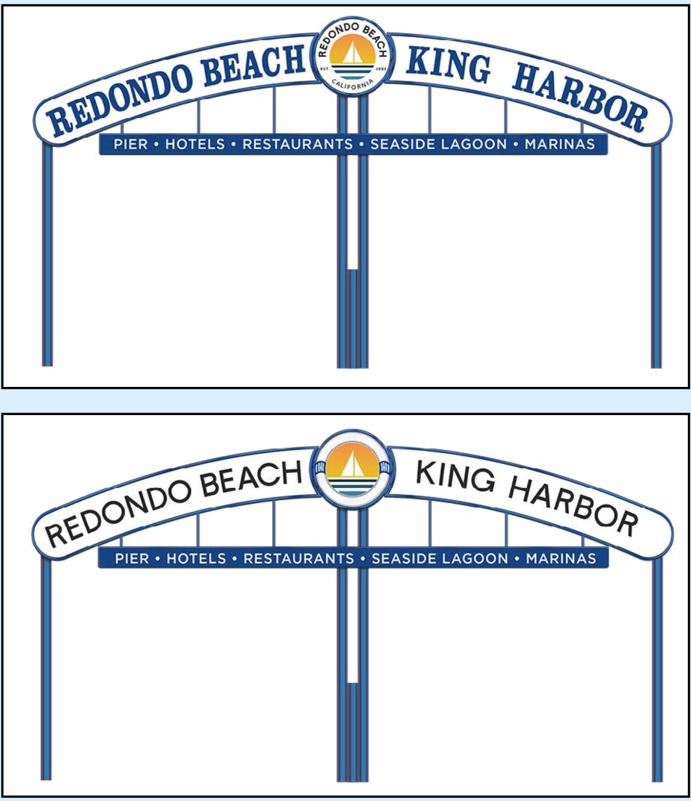
A Change.org petition calling for no changes to the city’s “Redondo Beach/King Harbor” entrance sign has garnered 1,672 verified online signatures as of Tuesday, and a long list of comments, after a Nov. 4 city council discussion about adjusting the lettering and the art inside the sign’s center circle.
The changes would not affect the shape or structure of the 1960s sign.
Comments include criticism of the proposed “weak, watered-down, now-trendy sans serif” type, and acknowledgement of the existing sign’s older style, along with what it signifies about heritage and the long-term identity of the city.
The petition was begun by “Redondo Ron.”
“Generations of locals are not happy with changing the one piece of Redondo Beach that represents so much more than what a few city councilmembers realize,” wrote one commenter. “… Listen to the people and stop trying to turn our town into the next Manhattan Beach.”
The petition seeks more public input before the Redondo Beach city council makes a decision. The council is expected to discuss the matter again sometime in December.


Why??? Why change the sign ? Sounds like something someone would come up with, out of boredom – such a waste of money!
Whatever was budgeted for this should go to help residents and programs.
The Council themselves recognize the iconic status of the King Harbor sign. A photograph of the King Harbor sign from 1969 illustrates that the sign has not significantly changed since its installation. The font, color and imagery has always been the brand of Redondo Beach. To throw it out is disrespectful of Redondo’s history and disrespectful to Redondo residents.
The artwork in the middle had substantive changes each time the sign underwent maintenance. The current artwork is less than 15 years old. The flags and decorative elements on the 1969 sign were removed in 2003
I really only care about the enormous waste of taxpayer funding. It’s like the logo change. WTF was that all about?
This is a timeless, welcoming icon in our City. To change any one piece of it shows a lack of respect to our city heritage and is short-sided thinking. Every dollar to change any aspect of this sign would be wasted, as the next “branding trend” in fonts, imagery, colors to come along will make it outdated. Leave it alone and honor its beloved place in our city.
I was down by the pier at the end of Torrance Blvd and that sign has more burned out lettering than operating letters. If that’s how the new sign will be maintained, then it shouldn’t have lighted letters. The welcome sign at the pier just looks tacky.