
by Garth Meyer
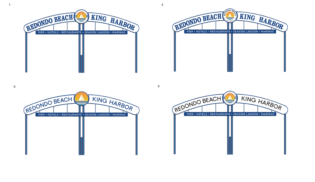
An update to the “Redondo Beach/King Harbor” sign is coming. The city council narrowed down changes in a Nov. 4 discussion, later to confer with its design consultant and finalize details.
Jordis Small of Stellen Design – who created the city’s new logo – put forth seven options for the 1960s arched sign at 190th Street and Catalina Avenue.
The Redondo council considered whether new lettering should appear in “just blue” or “branding blue,” and what revisions should be made to the amenities list beneath the arc: should “boat launch” be added, should “sportfishing” be taken out, since the sportfishing pier is gone from the harbor, could “restaurants” be replaced with “dining” or “food,” for space reasons?
“Portofino Inn” would be dropped in favor of “hotels.”
“There’s been a vitriolic response about taking out sportfishing,” said City Councilman Zein Obagi, Jr.
“I would prefer to keep ‘sportfishing’ on there.”
Should the main sign’s font which Ms. Small proposed be thickened? Should the original font be kept?
Should the word “marinas” remain on the sign?
Mayor Jim Light said no, that was unnecessary, as boaters already know where local marinas are.
Mike Witzansky, city manager, said “Seaside” could be cut from “Lagoon,” if need be.
“Do we need a nod to the old sign?” asked Councilmember Paige Kaluderovic.
“The nod is the sign itself,” Councilman Chadwick Castle said.
The shape of the sign will not change, only lettering and art would be modified.
“This isn’t just to make it prettier,” Obagi, Jr., said. “It’s for consistency, to continue to get investment in Redondo Beach by branding Redondo Beach.”
Lee Coller of the Harbor Commission spoke in public comment in support of keeping “sportfishing.”
“I strongly recommend including the boat launch,” added Mark Hansen, longtime King Harbor boater and city volunteer – just named the Redondo Beach Chamber of Commerce 2025 “Man of the Year.” “We’ve gone 65 years without a boat launch. It’s a wonderful advertisement. Let’s put in stuff unique to our harbor.”
“It’s tough to do this by committee,” Mayor Light said.
Witzansky pointed out that the planned boat launch would not be built for at least five years.
In the end, the city council settled on Option 7 for the sign update – with the new city logo in the center circle, and a potentially-thicker new font for the words “Redondo Beach / King Harbor.”
Wording for the amenities list was not decided upon. City staff aims to bring back a final draft for approval in December.
Earlier this year, the Redondo city council approved $134,000 in the 2025-26 capital improvements budget for the sign work.
It is expected to be finished midway through next year. ER


Design by committee is never a good idea. This new rendition of the grand arch is devoid of any personality, much like the modern huge box houses that are replacing the cottages on the avenues. And the fact that the new logo was designed by a contest for free, robbed a talented graphic designer and/or design agency of some income.
Her firm was paid for the design. The Council also ran a public contest at the request of the public. The original design from the design firm was selected. The graphics in the center of the arch has changed each time the sign was maintained. While some like the hand painted look, it is too detailed to be memorable – I asked over two dozen long term residents what was in the center of the sign. None answered correctly. I am a big advocate for preserving history in Redondo. But I don’t consider the artwork at the center of the sign to be historic. It was last updated sometime after 2010, so it is less than 15 years old. The objective of the gateway sign is for visitors. It should be something that is memorable in the short time a driver passes under or by the sign.
Jim, as stated above, I am a career professional creative director. Working at some of the worlds largest brands for over 20 years now. I completely understand the need for a gateway sign to be immediately memorable to visitors, but I’d like to offer a different perspective on why preserving the existing center artwork still matters.
1. “Memorable” doesn’t have to mean simplified.
Hand-painted work is memorable precisely because it stands apart from modern vector-style municipal graphics. The human touch is what people recall. Even if they can’t describe every detail. A memorable landmark is about character, not simplification. You personally not considering the artwork on the sign to be “historic”, and claiming it to be “too detailed to be memorable” is anecdotal and, respectfully, outside your professional expertise.
2. The artwork is part of the sign’s historical continuity.
Even if the current painting was refreshed after 2010, the motif itself has been part of the gateway’s identity for decades. Redondo’s history is defined by layers, updates, repaints, reinterpretations. Erasing the center graphic and going to an overly simplified version removes a visual thread that ties generations together, it becomes even less memorable due to lack of any character and charm what so ever. You keep saying this sign is only 15 years old, when there is clear indication that this sign was created in the late 1960’s and what has been updated are MICRO nuanced changes. The font, font weight, colors, graphic are all the same. So to blanket say it has no history is a flat out lie.
3. Local identity should outweigh quick-read design rules.
Drivers may only see the sign for a few seconds, but residents see it for a lifetime. Gateway signage isn’t only for visitors, it’s also a daily reminder to locals of what makes their city unique. Simplifying the art risks making it feel generic and interchangeable with any coastal city (you yourself even said, look at Manhattan Beach’s redesign. Why follow the coat tails of that city? We are Redondo. We have culture. In comparison, Manhattan looks more like Irvine than a beach town. Maybe consider taking up city council there?)
4. The community response matters.
The number of long-term residents who can’t recall the exact graphic doesn’t diminish its importance, it actually highlights an opportunity to restore it with greater care. Preserving the artwork creates continuity; replacing it creates a rupture.
5. Preservation doesn’t prevent modernization.
We can maintain the historical center artwork and improve readability, lighting, materials, and structural elements. This doesn’t need to be an either/or decision.
Ultimately, the existing artwork is part of Redondo’s story. Not because it’s old, but because it’s ours. Preserving it honors that history while still allowing the sign to evolve. Again, this should not be taken lightly. While Stellen Design has provided input, their recommendations are not meeting the standard required for a project of this scope. Continually citing them as a “design agency” to support the argument doesn’t hold weight here, because the work presented does not reflect the level of rigor or discipline expected from a professional firm. How long have they been a firm? Were other firms considered? A million questions can be asked as to why they are being used to validate the city’s very odd agenda of wiping the history and charm of the current visual identity to be replaced with drab clip art. What Redondo Beach deserves is top tier. Please understand the concern. This project needs hundreds of hours of thought and options to consider if this is going through. The proposed designs do nothing. Say nothing. And are more forgettable than a tchotchke seen at the local .99 store.
Frankly I think the sign is fine as is, and we shouldn’t be spending $100k to change our font to sans-serif to blend in with the Manhattan Beaches of the world. I for one, like the sign and its serifs as is, and I think the effects of this “branding” effort will be marginal.
The sign is due for maintenance. It has been in the CIP since 2023. The structure needs rust treated and then repainting. The plastic parts of the sign are faded and the paint is cracking. The cost will not change regardless of the font and artwork selected.
Then it only needed to be maintained.
The design is not free. The countless hours of people debating this are not free. Waste of resources.
The needless redesign has all the charm of an eye chart.
Like most other residents I do not like the new sign and wonder why we are spending all this money on it when there’s other more important problems to solve in the city.
The sign is due for maintenance. The structure is rusting, the plastic sign is faded and the paint is cracking. It has been on the CIP since 2023. The cost will be the same no matter what graphic and font are chosen.
As a professional creative Director of over 20 years, this is appalling, hideous, and absolutely pointless. Leave it alone.
This design is not in the best interest of our community. The historic gateway arch deserves more respect. . As do we.