
by Garth Meyer
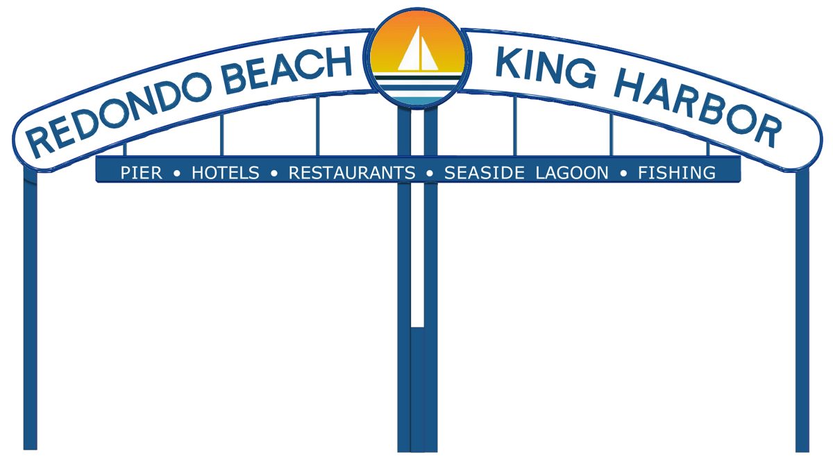
The “Redondo Beach/King Harbor Sign” will undergo a change after a unanimous city council vote Tuesday night.
The city’s new logo will appear in the center, replacing a commissioned painting from 1969, with the sign’s main lettering switched out in favor of the san serif font of the city logo. The lower listing of King Harbor amenities will be simplified. The council made the decision Dec. 9 after pointed public comment. The update-project began as a refurbishment job: for safety, durability and the continued visibility of the sign. The last time it was worked on was 2010.
Since the end of the ‘60s, when the current sign went up at 190th Street and Catalina Ave., its font, features and shape have largely been unchanged – though this is a subject of debate. The moniker have flag-pole pennants rising above it at the beginning.
Earlier this year, the city hired Jordis Small’s Stellen Design to consider refreshing the sign, after it adopted her design for a new city logo in 2024 – now appearing on street signs across Redondo Beach.
Small prepared seven options to revamp the “King Harbor/Redondo Beach” sign. The city council asking for her recommendation after an initial Nov. 4 council discussion led to a Change.org petition, with 2,048 signatures to leave the sign alone.
“The (existing) center artwork; it makes sense to replace with the logo,” Small said, noting that the lifesaving ring and painting inside was “hard to understand.” She gave both a professional and personal opinion, having she grew up in Redondo Beach.
“There’s nothing wrong with (the original) font, and in my personal opinion, I like the nostalgic (look)…” she said. “I honestly don’t want to make that call.”
Her recommendation was a version with the new city logo in the center and to switch out the old typeface for the sans serif of the new logo. Councilman Scott Behrendt made a motion to choose that, and Councilman Zein Obagi, Jr. seconded the motion. Estimated cost is $134,000 (new graphics and maintenance work).
Mayor Jim Light asserted that the sign most certainly does need refurbishing, as was evident through the telephoto lens of his camera, he said.
In public comment, a man reminded the council of how many verified signatures the Change.org petition drew, while wondering why more people had not come to city hall to speak.
“Make the sign look nice (but) keep it looking the way it looks,” he said. “It’s the number. 1 image of the city. The current sign looks older, nostalgic, with character.”
Another local named Jake also opposed a redesign.
“The sign never had a city logo or seal. (The center circle) was public art commissioned specifically for this sign,” he said.
He asked that the council put the matter on hold, to gather more public input, while doing the needed maintenance, and to register the sign as a California Historic Landmark.
“The city can take pride in it for generations to come,” he said.
Another resident said during the public comments, “My disappointment is you didn’t even consider asking the public. We are poised to make this a Historic Landmark… I don’t mind branding. Put it on everything except that.”
Josh McLeod, a graphic design creative director and Redondo Beach native, since 1978, said the sign “has equity, simply as it is.”
“Modernizing opens up the immediate risk of becoming a trend cycle. …You guarantee it will feel outdated the moment that trend and taste shifts… Historical character in artwork avoids the trap of modernization because it’s not trend-dependent. It’s authentic, it’s handcrafted… it tells you the place has a soul, a memory and an identity that survived time. You guys are trying to vaporize it.”
A lifelong resident called in a comment saying that he agreed signs need repair, but “this isn’t a city logo, it’s a landmark.”
“I have a Christmas ornament of it on my tree, I’m looking at right now, as I speak,” he said. “You guys represent us. This isn’t your decision to make.”
Councilman Obagi, Jr., said there has been “a tremendous amount of outreach, starting with the logo…” He said residents are complementing the street signs, and that a man at the Riviera Village Holiday Stroll last week said the new logo was “timeless,” which drew some laughter in the council meeting crowd.
Obagi, Jr. referred to online comments he had seen in support of the proposed changes to the sign. He tallied zero comments coming in from his constituents.
Councilman Brad Waller acknowledged the Change.org petition and said, “I do think people are going to start to associate the logo with Redondo Beach.”
He said he has spoken to a lot of residents, and most of them could not identify what is in the sign’s center circle.
He said he both supported making it a Historic Landmark, and giving it a new look.
“When it comes to public sentiment, we do represent 70,000 residents,” said Councilmember Paige Kaluderovic. “We have community meetings … More often those coming down (to a council meeting) are those in the contrary of something… I think the proposed changes are moderate. The sign structure is what’s important.”
Councilman Chadwick Castle said that he had taken the petition into account, and that he also heard from a few constituents who thought the sign was being torn down.
The sign’s current version goes back to 1969, with older signs dating back to 1941, and the 1920s. The King Harbor Lessees Association originally paid for the contemporary sign, with permission from the city to put it on public land. In 2003, after windstorm damage was deemed too expensive for the Lessees to cover, the city took over full responsibility. The sign’s structural poles were then repaired and repainted. The 2010 work included replacement of plastic components.
The new work is expected to be complete in mid-2026. ER


Honestly, the changes are subtle and not a big of a deal. I don’t know why some people are all upset about it. Of course, the loudest and most upset are the ones showing up to complain. To me, I don’t care that much and the changes look fine. I suspect most people feel the same and just stay silent because we have more important things to spend energy on. It looks similar, it’s a thoughtful update. Hardly anyone can see the fuzzy image in the middle and the new city logo is pretty nice.
I definitely agree the sign needs maintenance work. It doesn’t look good right now so the work has to get done. Might as well make the updates while they’re up there!